
UX Case Study :
STONNINGTON
LIBRARY
8 weeks
Duration
Methods & Tools
Desktop research, Interview and observation, prototyping & testing, Figma
Overview
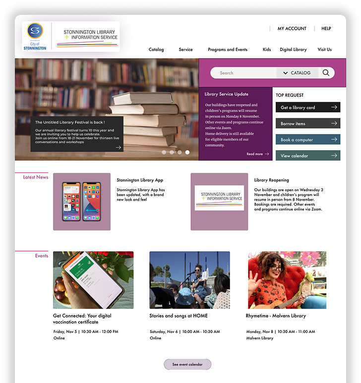
Stonnington Library and Information Service is a platform to provide library and information services to residents and visitors of City of Stonnington.
This UX Case study will focus specifically on the library homepage and book reservation flow. The goal was to identify any usability issues and redesign the website based on the research findings and recommendations.
This project is done as part of requirement to complete the UX & UI Design Course by RMIT Online.
Challenges
Homepage Clarity
Redundant icons, messy categories, and technical language created friction and confusion.
Reservation Confidence
Lack of clear confirmation and next steps left users unsure if they’d successfully reserved a book.
Accessibility for Mixed Proficiency
Most residents are likely tech-savvy, but the site must still support less experienced users and those needing assistance.
Discovery Phase
The Approach
Hypotheses
Ineffective homepage design leads to confusion.
Redundant icons + poor categorization slow comprehension.
Reservation flow lacks confirmation and closure.
Desktop Research
Reviewed Stonnington community profile to understand likely digital comfort while noting the need to support less experienced users.
Interviews & Observation (n=3)
Explored overall experience, pain points, emotions, and suggestions while observing navigation paths and language triggers; clustered notes in an affinity map.
Key Insights (Pain Points)
Confusing navigation & language (e.g., “suspend until,” “not required after”).
Missing confirmations—users left hanging after tasks.
Redundant, unorganized categories on the homepage.
2. Design and Development
Copy Restructure
Simplify terms; reorganize categories; remove redundant icons.
Strengthen search to handle partial keywords.
Reservation Flow Enhancements
Add tooltips for ambiguous terms and a tips box explaining borrowing steps.
Show queue position/availability before reserving to aid decision-making.
Interface & Hierarchy
Surface only relevant info during tasks; elevate primary actions to expected locations.
Keep Help consistently visible for inexperienced users.
3. Testing and Iteration
Low-Fidelity Prototype → User Testing
A small round of tests indicated the overall flow felt better but exposed gaps.
Notable Findings → Changes
Show availability directly in lists to speed decisions.
Reduce non-essential details during tasks (lower distraction).
Reposition overlooked primary buttons.
Keep Help accessible at all times.
The Prototype
You can try the prototype below and click on the blinking buttons or fields or scroll down
Results
The redesign delivered a clearer homepage with simpler language and leaner categories, helping users find what they need faster. Reservation confidence improved thanks to explicit confirmations and step-by-step guidance, while task completion became smoother with availability shown up front, primary buttons placed where users expect them, and help kept persistently within reach.
Recommendations /
next steps
From the annoyance I encountered as a library member when using the website, I was able to go through the research procedure and set aside my emotion as a designer and put user as the center of the design purpose. I learned that even the simplest adjusment take rigorous effort to make sure that the amendment is the best for user.
There are many things from the website that can be improve for the next iteration process. In the initial research, incorporation of tool like HotJar to map out the user behavior can add valuable information or using google analytics to glean relevant data such as bounce rate, engagement, average sessions durations, etc. In the testing phase, the more diverse user including vulnerable group should be done to assure the representation of the sample population.