
Yume Food
Revamping Buyers’ Experience
Overview
Yume Food is a social enterprise that aims to solve the food waste problem in Australia. The B2B platform of Yume connects leading food suppliers, retail businesses, and food rescue organizations to sell and donate surplus food stock. As the business grows, the platform is starting to face limitations in accommodating user needs, particularly for the buyers. Given that buyers are an essential pillar of Yume's business, it is crucial for Yume to ensure the best possible experience for them when using the platform. As a result, the product team is actively working to enhance the buyer journey through a revamp process.
Timeline
2022-2023
My Role
Product Designer
Practices
User Flows, Information Architecture, Prototyping, User testing
What problem do we tackle?
Buyers
The process of placing offers in Yume platform can take a long time and requires many steps. Because of that reason, some buyers prefered to contact admin directly in order to place offers for products. This process is very manual and takes a great portion of admin to intercept in helping buyers to put in an offer. Even if the buyers proceed themselves, they cannot submit multiple offers at once. These situations cause frustration for both buyers and customer-contact staff and represents an avoidable cost to the department.
Business
At the same time, after 6 years being in the industry, the business model evolves and the way the platform currently works is no longer able to accommodate what the business wants. With the increasing number of suppliers joining the platform, conflicts arise in presenting products in the platform, as multiple suppliers may offer the same product. Additionally, the business aims to maintain supplier anonymity on the platform ensuring that Yume remains the main solution provider for food surplus.
Goal
The main goals of the buyer revamp are :
To enhance the user experience for both existing and new buyers in placing offers and to provide visibility into the outcomes of their orders.
01
To ensure the technology is user friendly so it helps luddite buyers make the transition to a new way of working
02
To incorporate the business need while maintaining a streamlined process for buyers
03
Research
Initial interview reveals that there are 3 key areas to improve :
Functionality gaps
Offer/Order process
Product listing information
Buyers have expressed frustration with the current process, having to go through each step individually for every product. They also desire a centralized page to monitor the progress of their offers, providing timely updates on whether their offers have been accepted or not. Achieving consistency in unit terminology is important to avoid mental strain for buyers who have to adjust to different formats.
Buyer Exploration Interview
Data from Hotjar and Google Analytics provides supporting evidence for the interview findings. The data aligns with the interview results, indicating that the most visited pages on Yume's platform are the "All deals" page, where buyers can view all products, and the “Homepage”. Interestingly, the Hotjar Heatmap reveals a significant drop in scrolling activity on the homepage after the initial visible area. This suggests that users do not extensively use homepage.
Dekstop Research
Pic: Heatmap of Yume homepage
Pic: Heatmap of product page
Pic: Most viewed pages from Yume platform
Reimagining buyer’s flow
The information we gathered has brought us a step forward in understanding the pain points of the buyers. Through consultation with the Business Department, we conducted prioritization mapping to determine which problems should be addressed in this iteration. This process led to the formulation of solutions that cater to the needs of both the buyers and the business.
Pic. The new proposed journey for buyer in Yume’s platform
Solutions
Some key highlights of the proposed solutions include the addition of new features, implementation of a new flow, and optimization of existing pages.
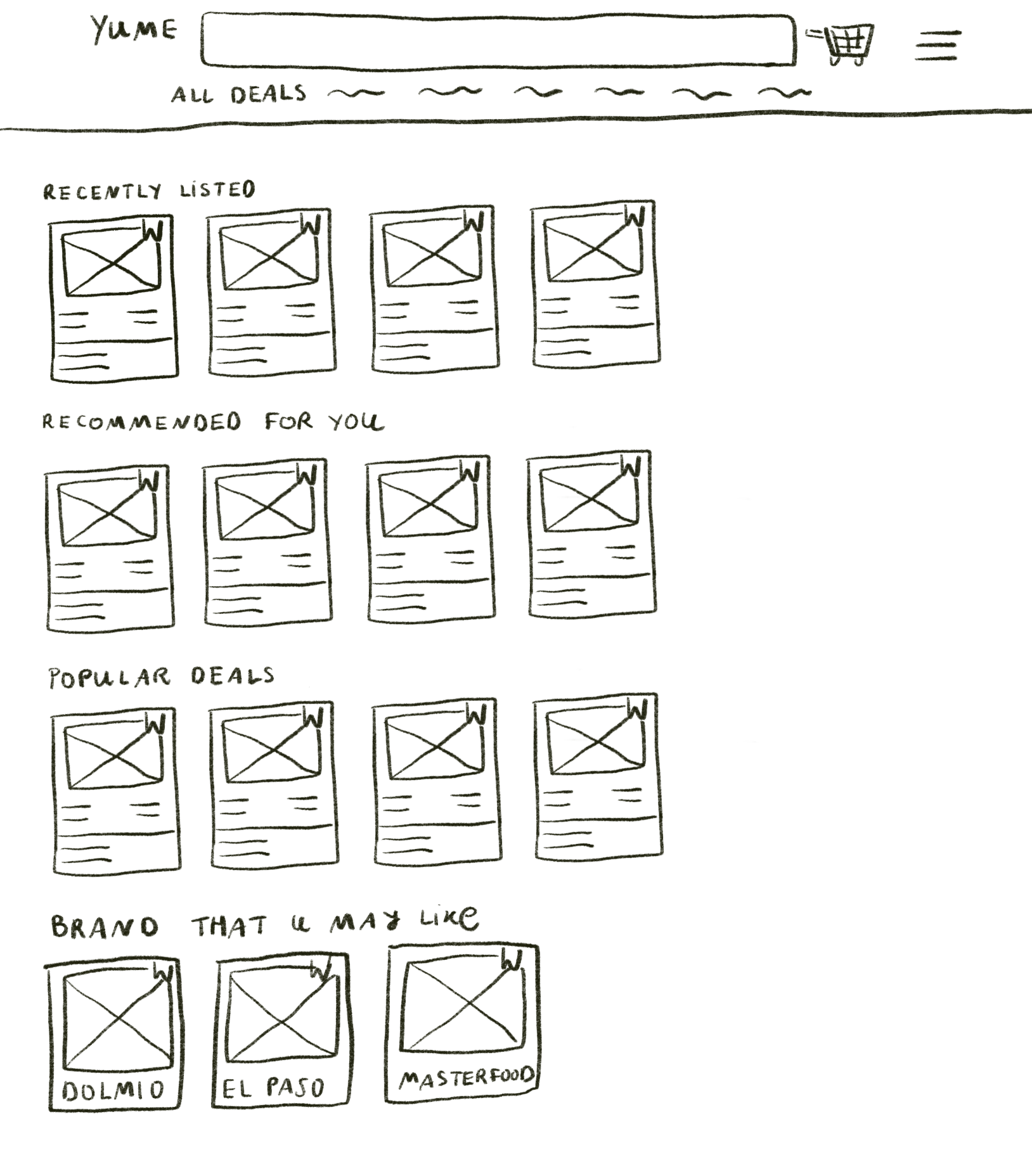
Homepage
The buyer's homepage is personalized using a recommendation engine based on preferences and past purchases, highlighting key information like new products, last chance items, and top supplier offerings.
My Wishlist
Wishlist feature allows buyers to save products for future reference, creating personalized collections for later examination and potential purchase.
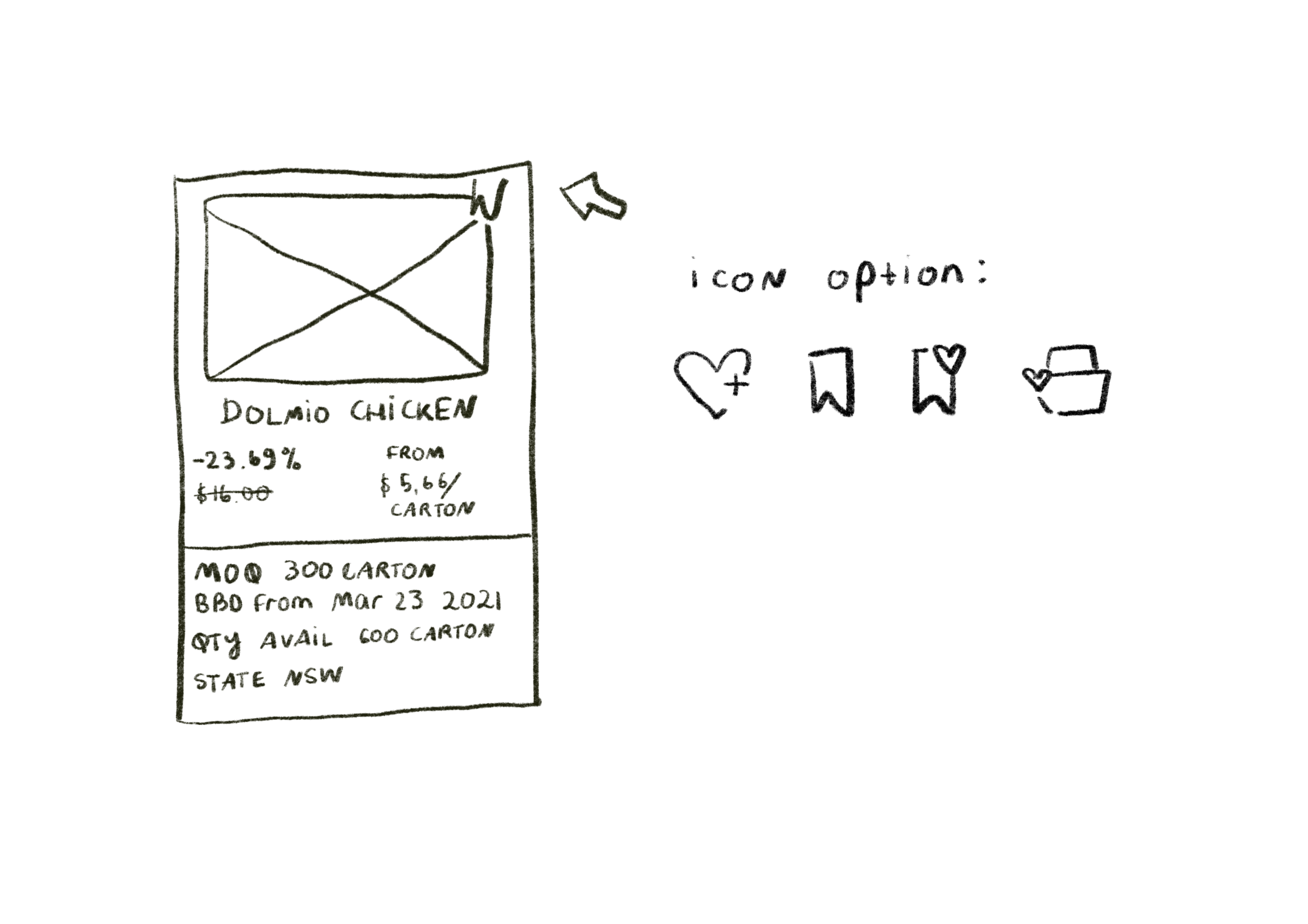
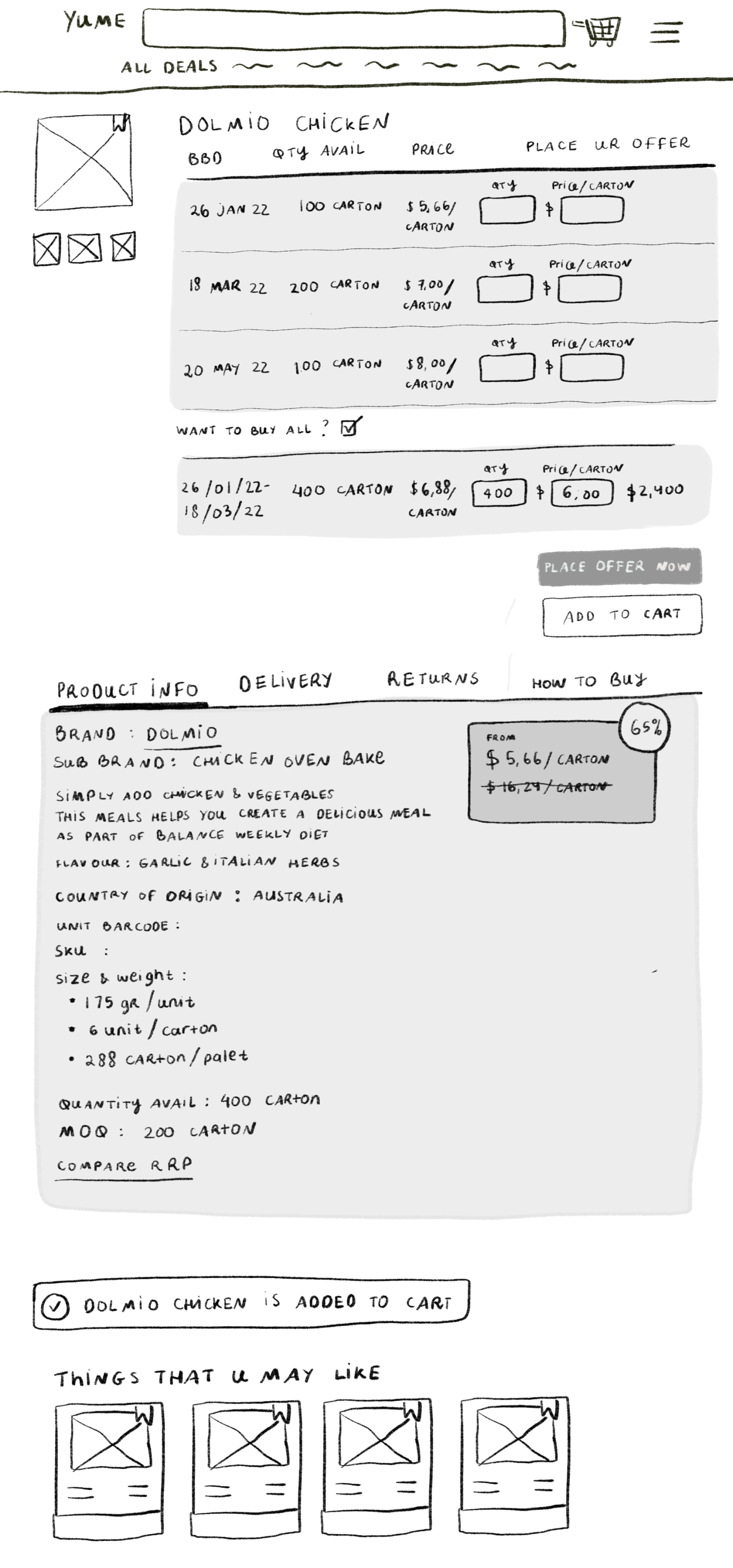
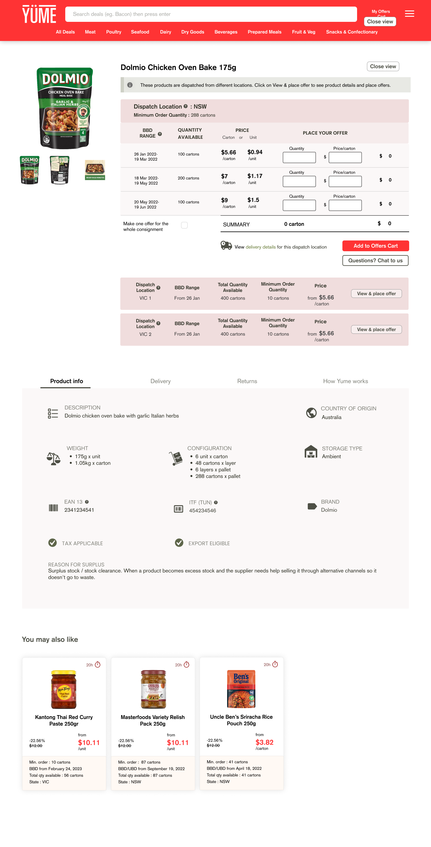
Product page
To cater the needs from business and buyer’s side. Product page is given a total make over. Previously, the page only displayed one product from a single supplier, but now it can showcase the same product from multiple suppliers, each with different pricing for various shelf life ranges.
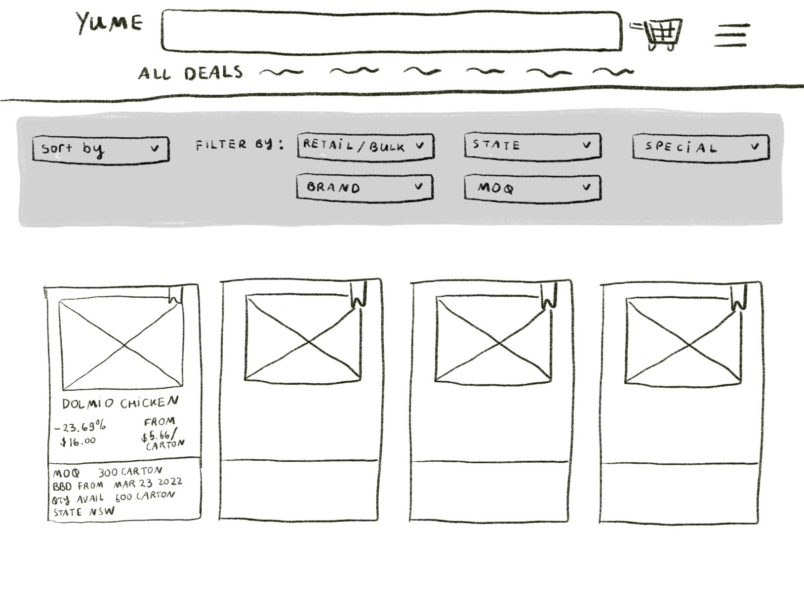
Filter feature
This new feature enables buyers to easily sort products based on various criteria, including product type, storage type, delivery destination, discount category, and upload date. This saves buyers from having to manually scrutinize each product individually.
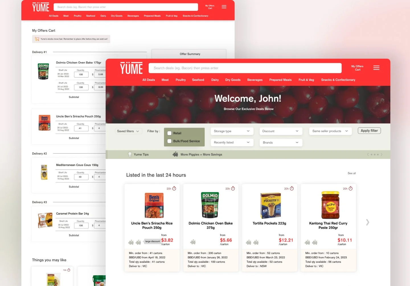
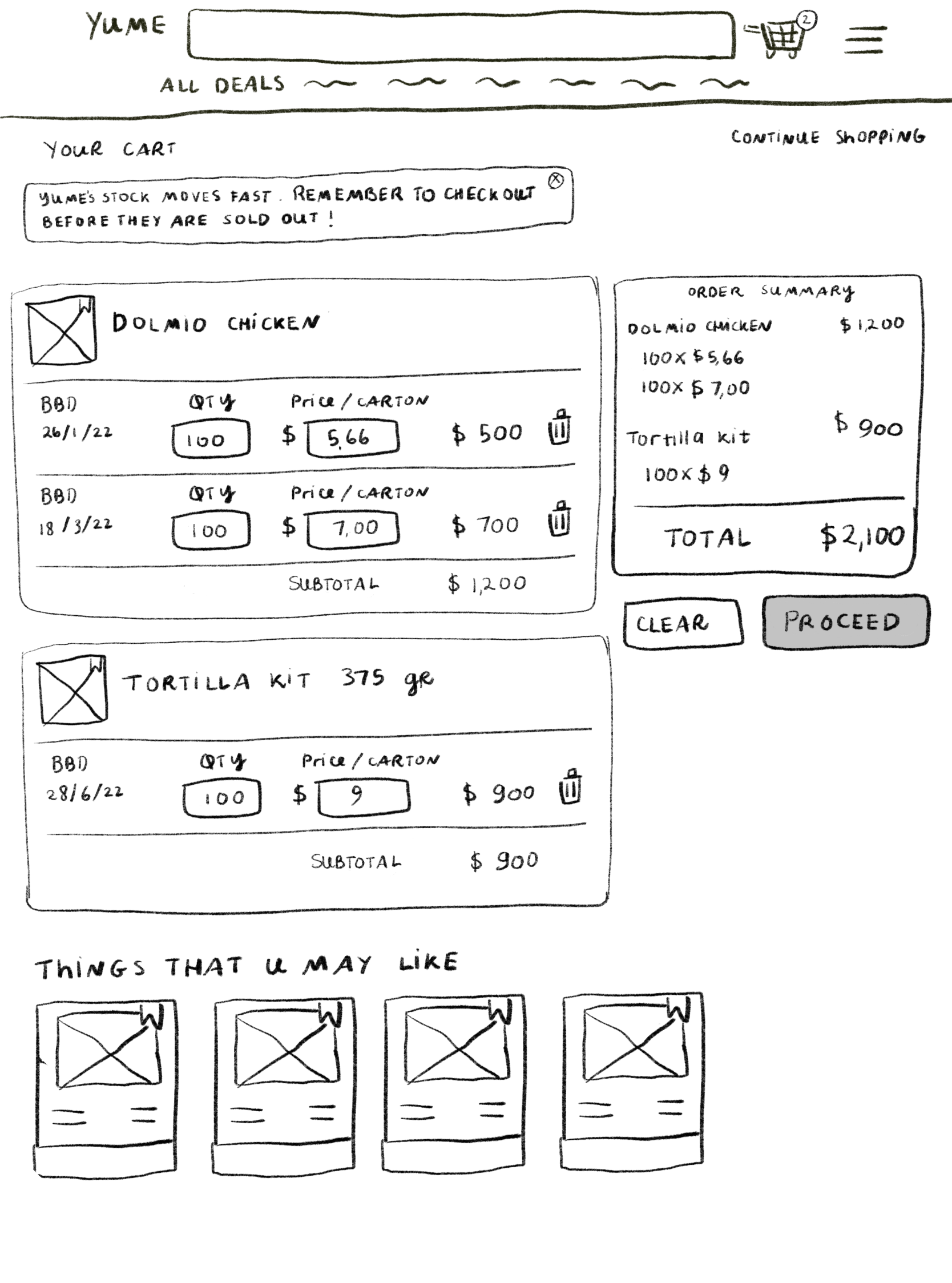
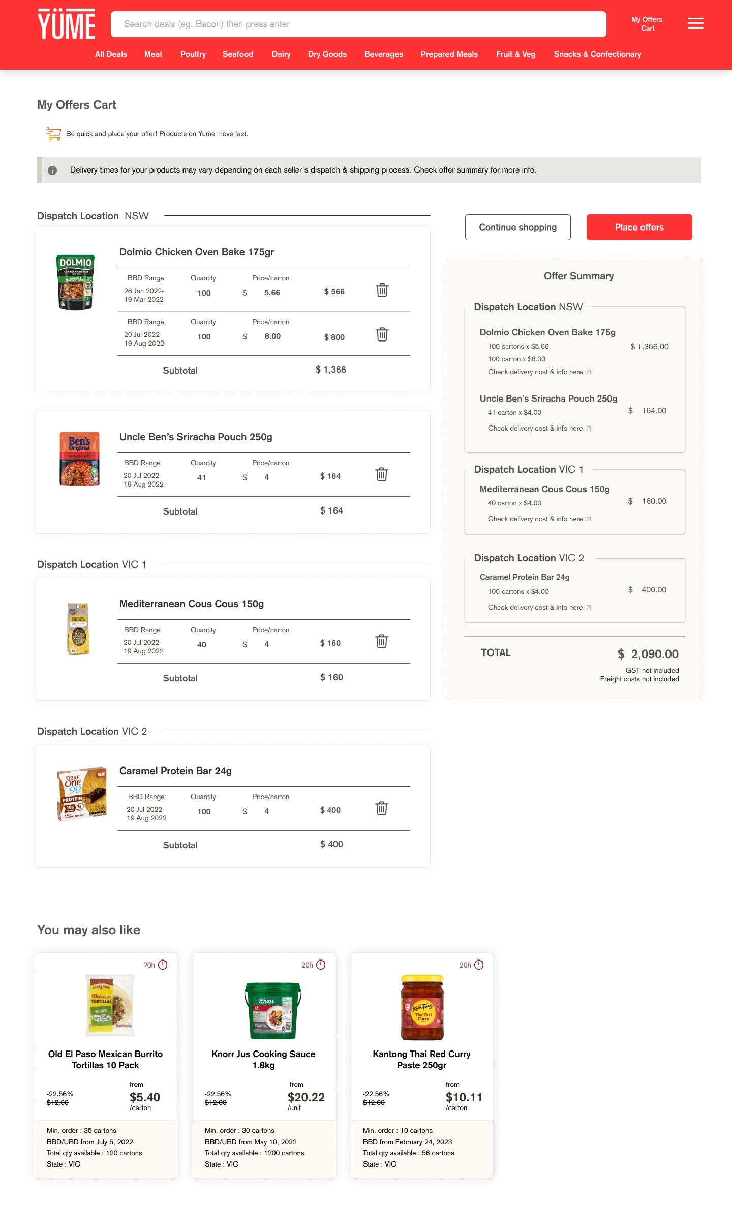
Mini Cart and My Offers Cart page
Cart feature is completely new concept to streamline the buyer's experience, eliminating the need for multiple steps when bidding on multiple products. With the cart, buyers can conveniently add multiple products and avoid the hassle of going through the checkout process multiple times.
My Purchases page
Unlike the previous version that only displayed offer history, the revamped My Purchase page serves as a centralized hub to monitor offer progress, view purchase history, take actions for delivery details (such as providing a Purchase Order number or reporting delivery issues), and submit counter offers.
Low-fi prototype
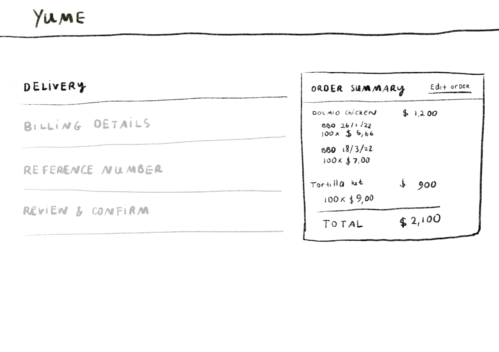
Pic. Example of pages from Low-fi Prototype
Hi-Fi Prototype
Testing
Usability test goal
To learn if users are able to complete specified tasks successfully
To identify how long it takes to complete specified tasks
To find out how satisfied participants are with Yume buying platform
To identify changes required to improve user performance and satisfaction
How do we test?
The proposed solution was tested remotely via Zoom call with two categories of Yume's users: old and new users. Participants were assigned a series of tasks and provided with follow-up questions after each task. Once the full set of tasks was completed, participants filled out a post-test survey and underwent an interview.
Initially, Useberry was planned as a tool to gather qualitative data, but it was ultimately decided to proceed with testing without using Useberry due to its complexity and the technology proficiency of Yume's buyers.
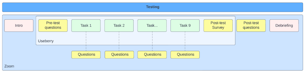
Pic. Buyer revamp usability test plan
Iteration
The testing yielded interesting findings. Overall, buyers expressed satisfaction with the platform changes. Contrary to our initial expectations, features like the Mini cart and My Offers page were easily navigated by buyers without any challenges. However, feedback indicated that the Wishlist feature was not relevant for Yume's buyers, as the fast-paced nature of the platform meant buyers typically knew what they wanted to purchase and placed offers directly. The Wishlist feature may be more suitable for B2C customers. Additionally, changes were made to the platform's copywriting to ensure buyers were more aware of Yume's terms and conditions. As the business model evolved during the iteration, some other changes were implemented
Hi-Fi Prototype After Iteration


Homepage
Buyers like the new personalized sections of homepage. It will help business to boost selling performance by capturing buyer’s attention to curated products
Filter
Buyers were interested in using the filter feature that allows them to find relevant products for their business
Product page
Following the testing, there are some changes:
Product page for multiple suppliers has been enhanced by incorporating additional details, including a delivery indicator for each supplier and a question button for each supplier and question button
Delivery tab is provided with Delivery cost based on configuration (per pallet or per space)

Mini cart
The Mini Cart feature received a positive response from buyers, as it provides an instant summary of their offers.
My Offers Cart
My Offers Cart is seen as beneficial for providing reassurance before submitting offers collectively. The previously ‘Select All’ feature is removed to avoid complication.
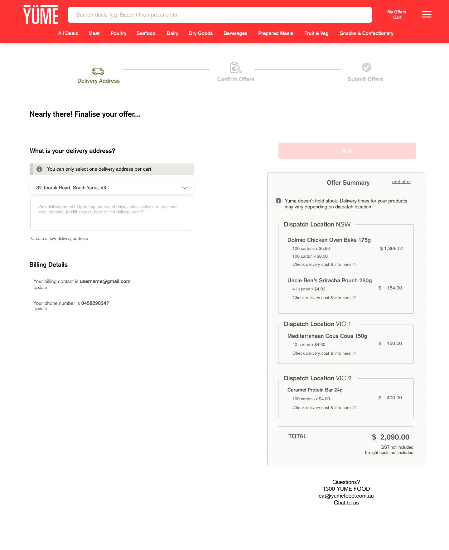
Checkout page
Post testing, the checkout page now includes clearer explanations and a prominently displayed tick box for the Terms & Conditions.
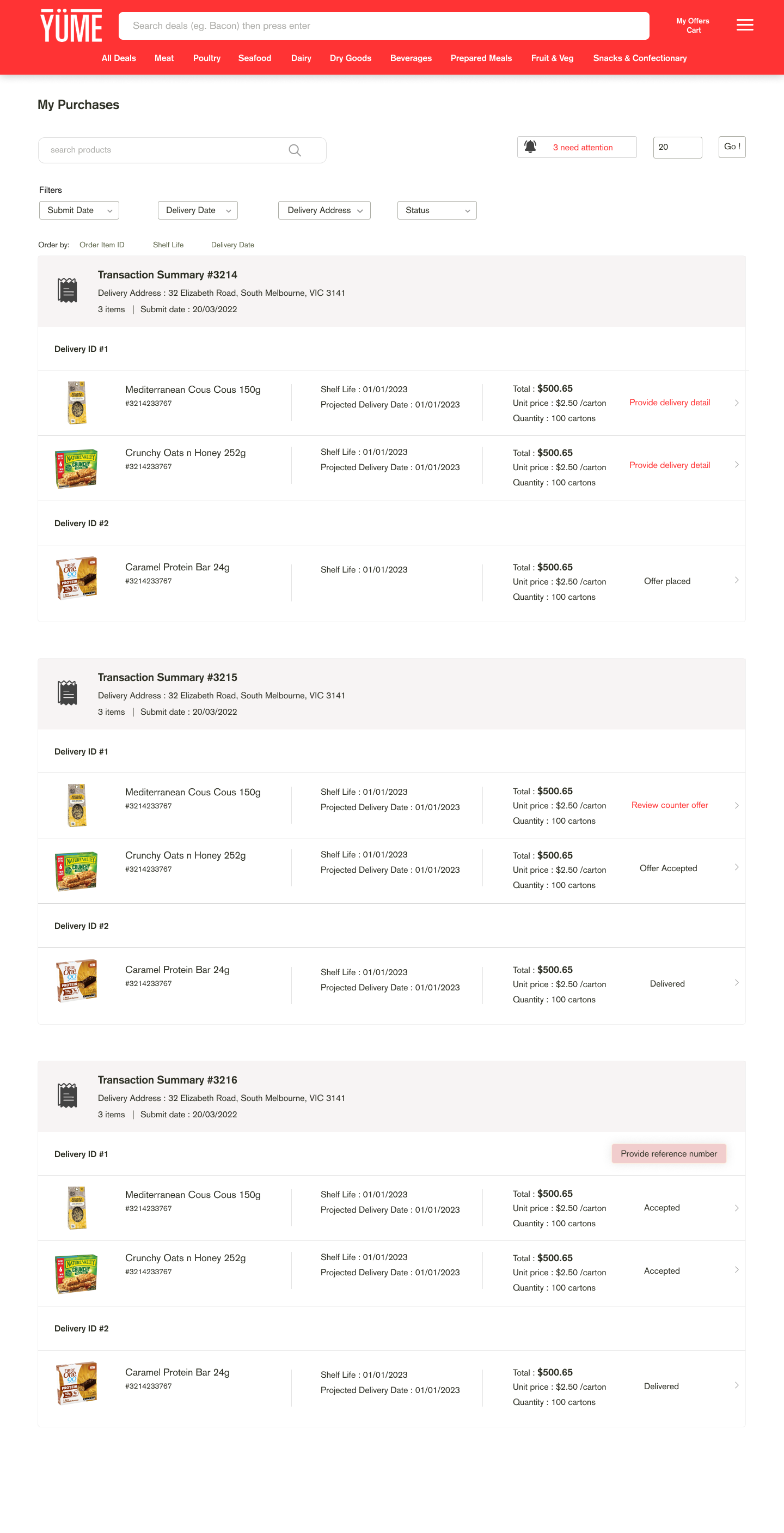
My Purchase page
My Purchase page is well received by buyer and after testing and we added some more functionalities for buyer to action on
Reflection
After careful consideration, the development and launch of the features will be divided into two parts: Buyer Revamp 1 and Buyer Revamp 2. This decision takes into account the scale of the changes, the buyer's cognitive capacity to adapt, and the resources available in the product team. By delivering the changes in phases, the team can ensure quality for the users.
The Buyer Revamp involves a rigorous process from multiple perspectives, particularly due to the complexities involved in restructuring the data and the transition of roles within the product team. This led to some delays in finalizing the data transition.
During the Buyer Revamp, Yume as a start-up is also growing and establishing its identity, which impacts both the revamp itself and the workflow within the product team. As Yume's business model evolves, adjustments need to be made to the design and journey of the new platform. To manage the changes effectively, the product team has established rules regarding which changes will be implemented in this iteration or the next. This ensures timely execution and prevents an endless list of changes.
Furthermore, the product team is continuously iterating and refining their approach to best fit Yume's needs, including workflows, research methods, and tools. This phase involves not only iterating on the products themselves but also on how the product team collaborates and works together. Fortunately, the team has shown great collaboration, openness, and support throughout this process.