
Overview
When I joined Yume, there was no established product team, and as an intern, I became the first person to take on this role. As I started working on projects, I quickly realized the absence of guidance or references. The external consultant had designed the existing platform, leaving me with only the brand guidelines provided by the marketing team to rely on. Nevertheless, I knew I had to start somewhere.
I started with component library for every projects, but as the number and complexity of the projects increasing, the components starts to get messy and harder to trace. That’s what I consider the call when design system is needed. So, I then proposed to PM that I could start slowly building Yume design system as side project with main project still on track
January 2023-on going
Timeline
My Role
Product Designer
Why does Yume need one?
Redundancy
There is duplication of effort in designing and developing similar components. With multiple projects underway, Yume’s component library has become increasingly complex, messy, and scattered.
Inconsistencies
As Yume platform continues to develop, I incorporate numerous new components, images, and icons from various sources. While efforts are made to maintain a consistent style, inconsistencies can arise.
Lack of Usage Guidelines
Currently, there is no existing guideline outlining how to properly utilize our design materials, resulting in uncertainty which typeface, font, and size combinations should be used for different context.
A design system benefits Yume and design teams by ensuring consistency across platforms, devices, and touchpoints, strengthening brand recognition and trust. It also promotes efficiency with pre-defined components, styles, and guidelines, reducing duplication of effort, accelerating design and development, and enabling scalability for complex projects.
Benefit
To initiate the design system project, I conducted thorough research by delving into the guidelines set by well-established companies like Atlassian and Headspace, which have robust design systems in place. Additionally, I sought out other designers who had encountered similar challenges, seeking insights and learnings from their experiences.

Research
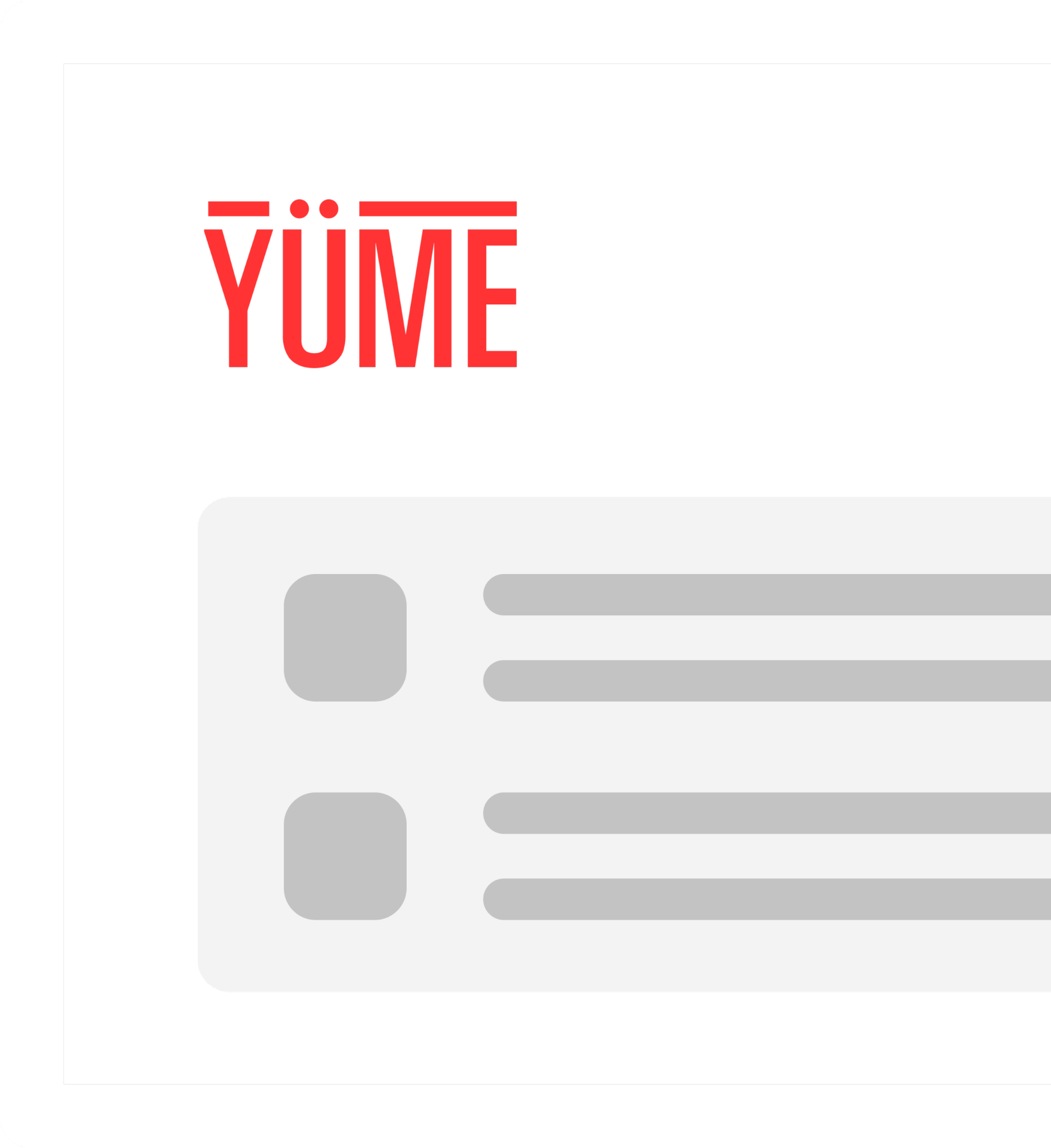
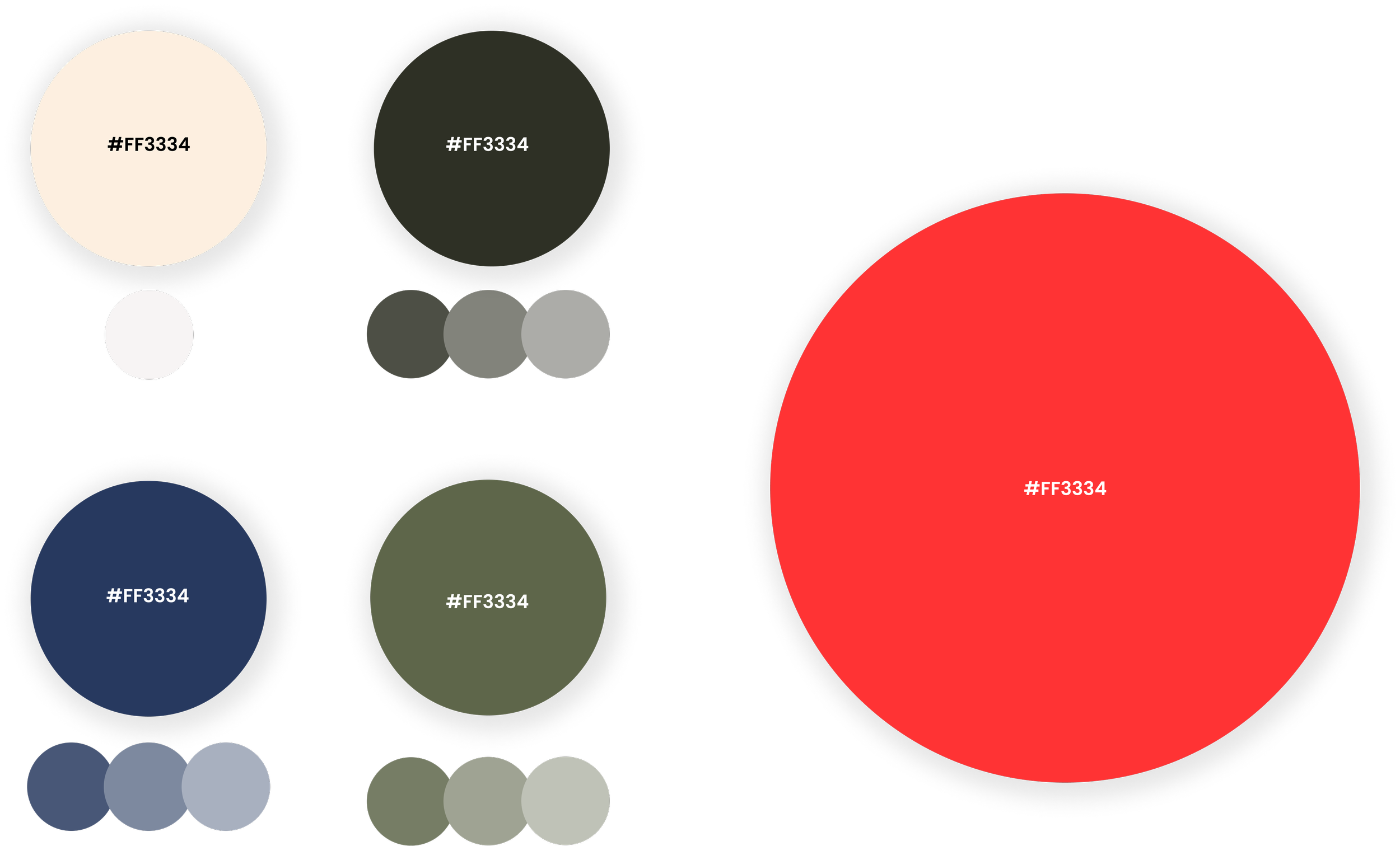
Yume’s Brand Guideline
Yume has a defined set of brand guidelines that encompass various important elements, including the logo, color palette, typography, and imagery. However, specific usage guidelines for these elements on the website are currently absent. It has been observed that certain colors convey a somber impression, which led to discussions and subsequent adjustments to make them more suitable for digital products.
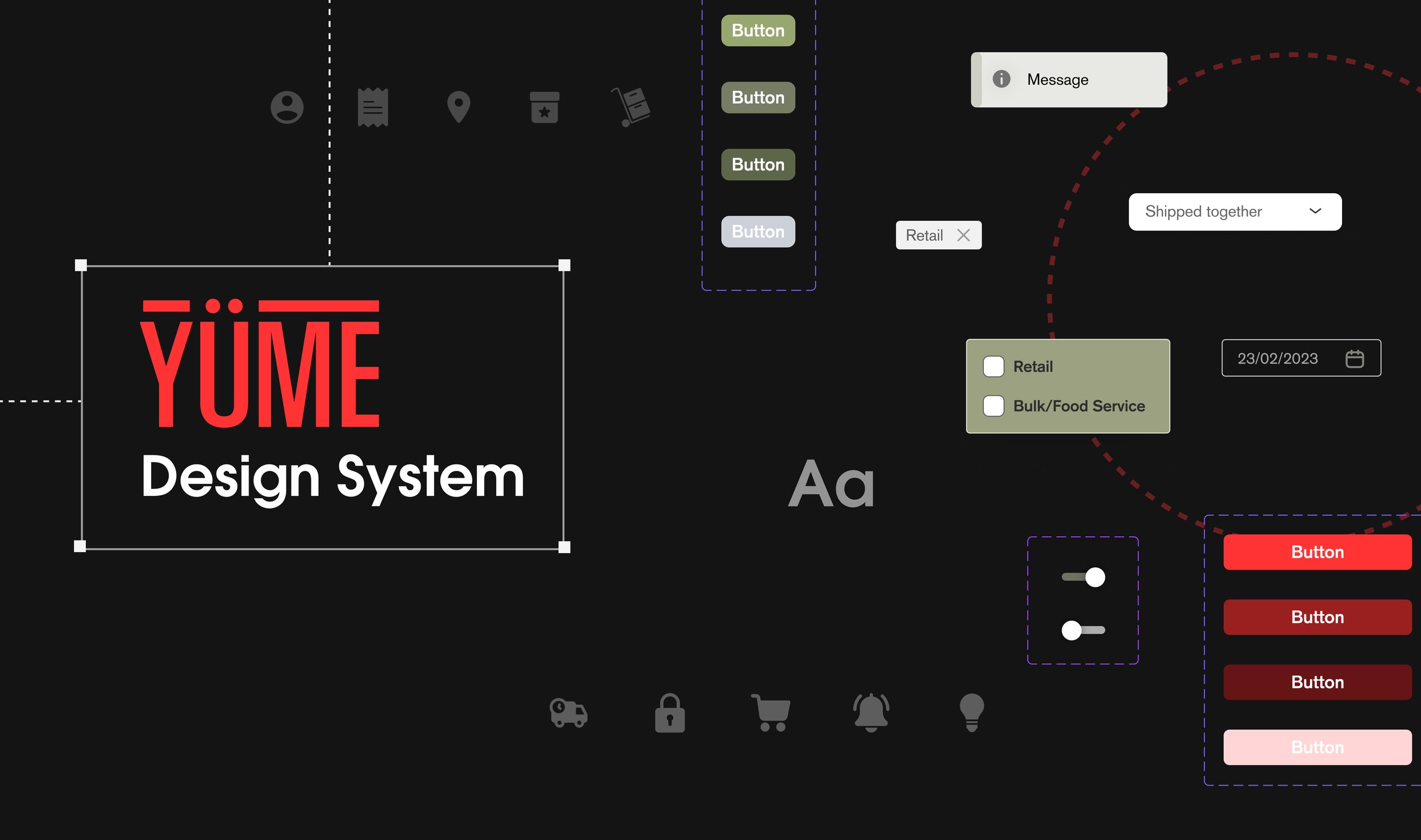
Design System Structure
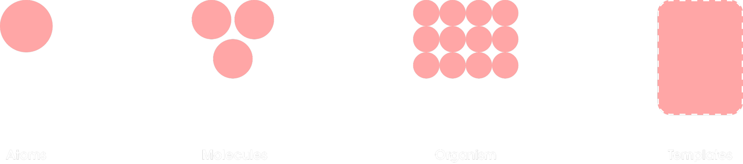
01
Color
Primary & secondary color
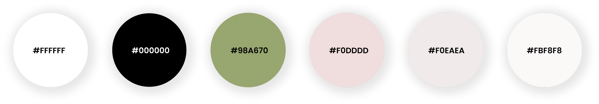
Supporting color
02
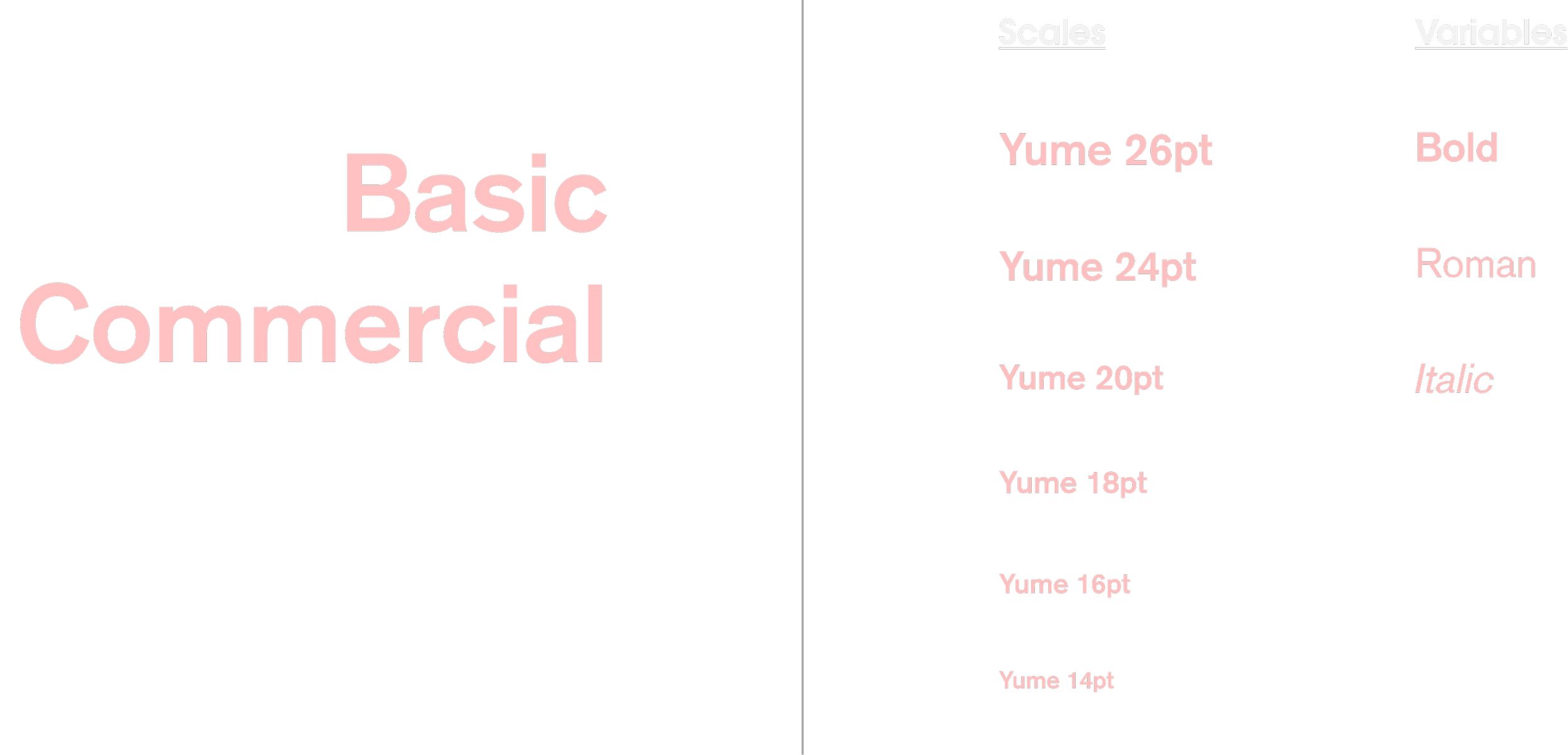
Typography
03
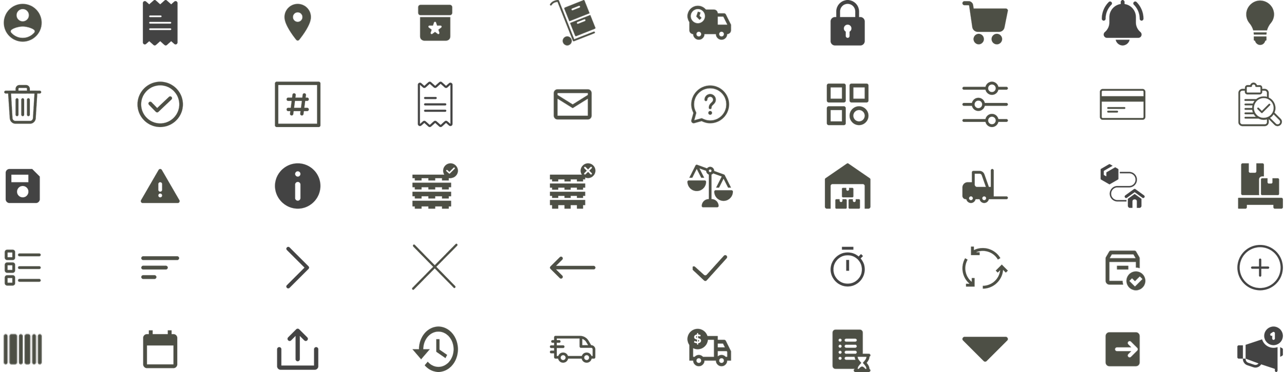
Iconography
04
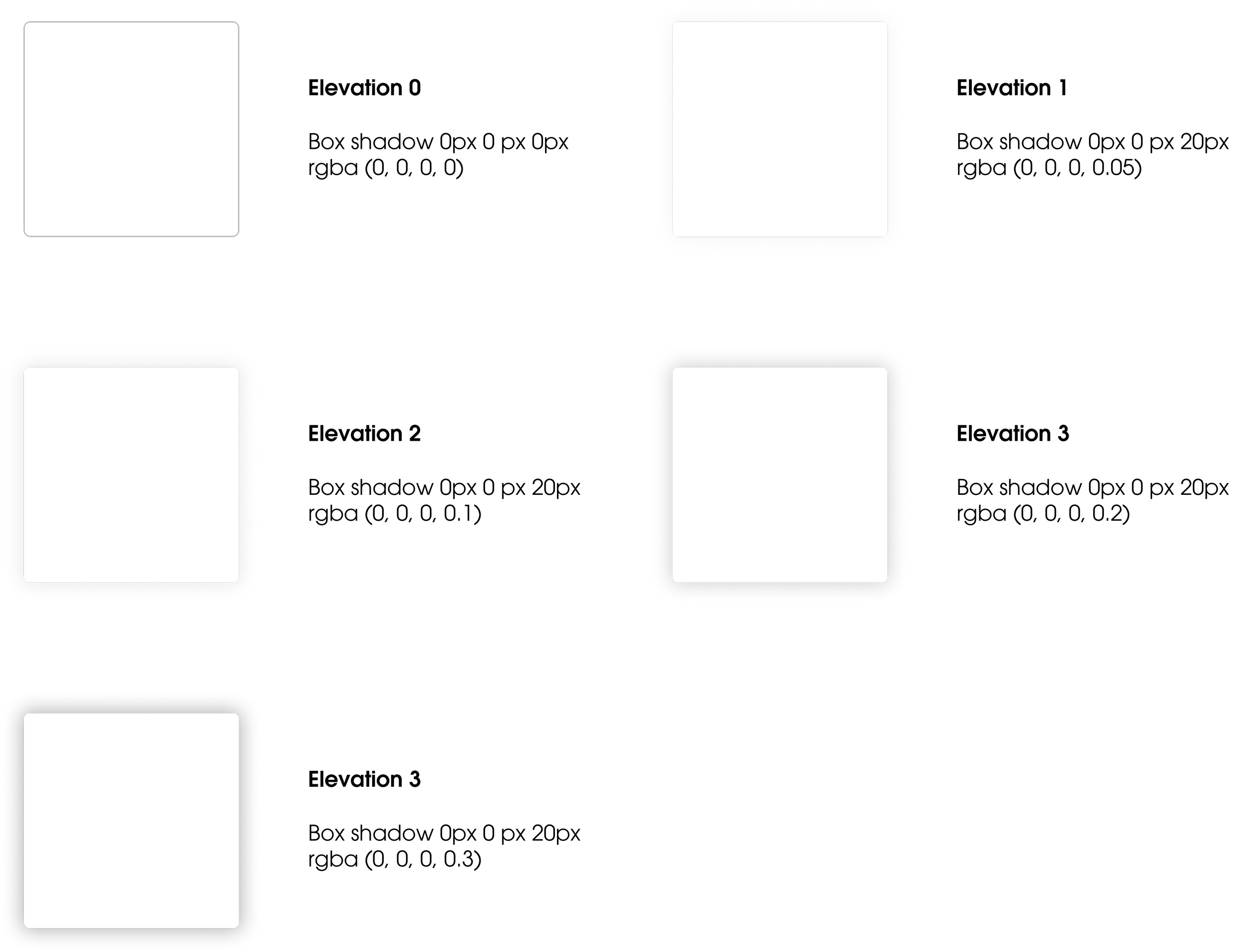
Elevation
05
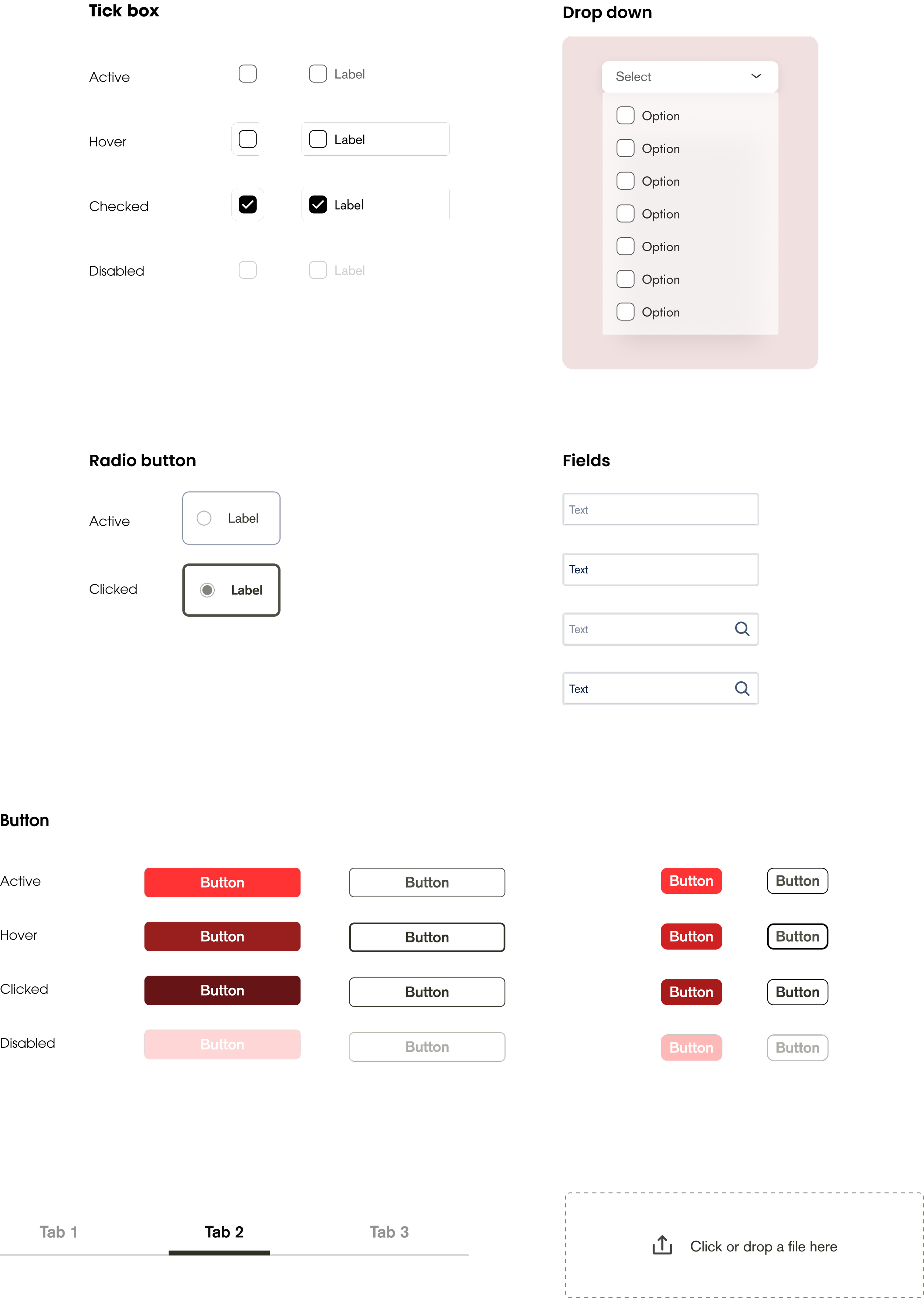
Component
06
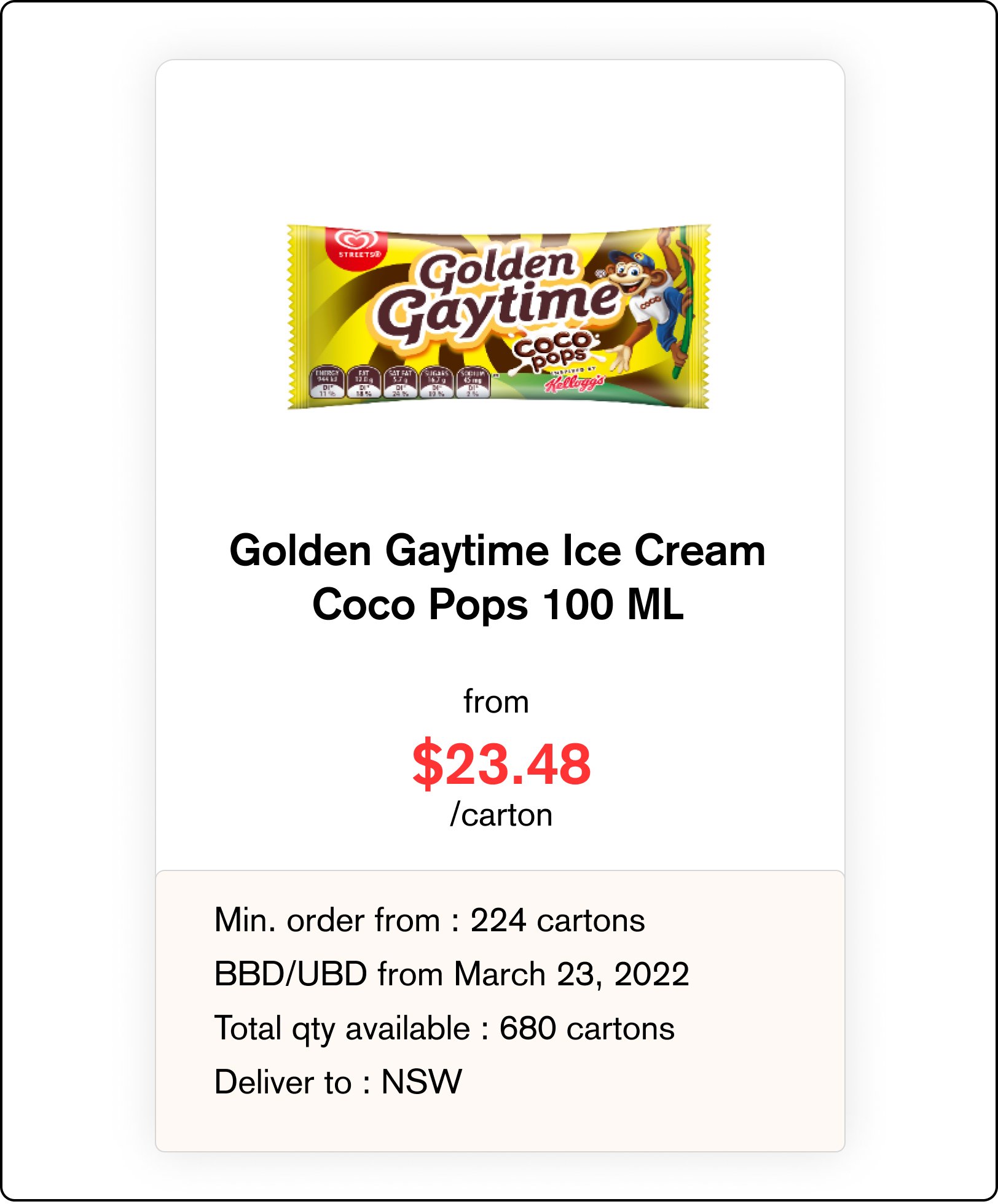
Card
Conclusion
Documentation
In this first phase of design system, documentation is still being developed and all the rules are described in FIgma.
Further Development
The development, maintenance, and enhancement of a design system are ongoing processes. As we consistently utilize and extend it across various teams and organizations, the design system will evolve to encompass all the necessary elements for building any product.
Improving collaboration between developer and designer by utilizing this design system that allow designers and developers to work together seamlessly.
Lesson Learned
The development of design system is challenging but I’m proud to have proposed the initiative so that it will smoothen the product team process in the long term. Throughout the process, I gained valuable insights into resource management, coordinating various components, and ensuring smooth synchronization with developers to achieve positive outcomes.